About flown flags
This library modifies the source artwork of international flags. The changes aim to resolve some issues with those available from other sources.
Modifications include:
The library aims to make these modifications while minimising deviation from official designs.
Making these changes has also enabled very small file sizes and the introduction of a limited, predictable subset of SVG tags. Both of these should make the library a good choice for downstream users, who can add their own creative modifications as needed.
Aspect Ratios
With few exceptions, flags are rectangular, but their sides occur in many different ratios. Though some argue that the original intentions of the design should be always be upheld, this is rarely done in practice.
The proliferation of differing ratios is not critical to recognition. Flags are frequently used as visual affordances outside of official contexts. Emoji pickers provides one example. Here, mismatched proportions are ignored to streamline vertical and horizontal scanning, allowing edges to align perfectly. Here, many minor variations would appear irregular at best, or unintentional at worst.
Designers identify such inconsistencies as a distraction that should be minimised whereever possible. Their layouts often compose systems of repeatable blocks, and rely on consistently sized shapes. With no standard to employ, the temptation to constrain flags in situ is inevitable. However, an ad hoc approach must either stretch or crop important elements. Redrawing the flags allows adjustments that minimise distortion.

Deciding on an aspect ratio is a difficult choice. The most commonly used ratio is 3:2, of which there are 109 flags in this library. However, 2:1 is also common, numbering 81 flags. The gap between these two ratios is significant. When narrower designs are adapted to a wider format, they appear stretched. The same is true in the other direction — wider flags look uncomfortably squashed in the narrower format. To compromise, an aspect ratio of 5:3 is used. While less common than the first two, it offers a happy medium, distorting more flags but to a much lesser degree.
Modifying the shapes of flags without introducing unnecessary distortions is a substantial undertaking. With that in mind, changes have been made in a way that aims to tread as lightly as possible. Each flag has been scaled using strategies that cater to their specific design elements.
Horizontal, vertical and diagonal bands are stretched to fill the new dimensions.
Emblems and other items in the foreground maintain their proportions when scaled. For example, if the new flag design is 120% wider, the foreground elements are increased in both directions by 110%. This balances the change in distance to the vertical and horizontal edges. However, when bands of colour closely contain emblems, they are left unscaled to prevent intersecting elements.
Large items like squares and triangles are scaled in a way that best compromises between the competing relationships that inform them. For example, if an equilateral triangle points to the center on a narrow flag, it cannot be widened and keep equal sides. Instead, it is stretched to a lesser degree, keeping something of the equilateral triangle while still pointing near the centre of the flag.
Colours
Despite the frequency of primary colours, flags exhibit a large degree of subtle variation in the precise hues that are used. While some flags dictate the use of specific colours, others are less so. flown aims to preserve the colours intended by the design as closely as possible, while limiting the total number of colours included in the overall palette.
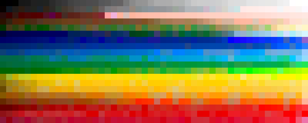
Limiting the colour palette means the flags in this collection do deviate from their official designs, a concession already made for aspect ratios. However, it ensures that when flags are shown together, the different combinations are predictable and unlikely to clash. The small, predefined palette also enables more creative modifications for downstream users.
Choosing the best approach to align these colours requires some thinking. An overly minimal approach forces unnecessary substitutions, significantly altering the original designs. The final palette must meet the needs of the flags, rather than arbitrarily enforce subjective preference.
To construct an initial palette, the full selection of colours was reduced to smaller sets of various sizes using colour quantisation. This exploration provided a reduced palette of 16 colours able to reproduce most flags with reasonable accuracy and minimal duplication.




But this mechanical selection wasn’t perfect. The quantisation was performed naïvely, treating all colours equally regardless of the area they cover. Rare but significant colours — like the turqoise variations used by the Bahamas and Uzbekistan, or the maroons of Qatar and Latvia — were lost in the averages. Other detailed elements were too complex to resolve without additional shades. To resolve these shortcomings, the palette was carefully expanded to 32 colours. New colours were added manually to fill gaps according to the flags that were most affected. The original 16 colours were adjusted to complement these additions.
To prevent introducing too much bias, the palette is mapped to the original flags by computing the CIEDE2000 colour difference in L*a*b* color space. This ensures consistent mapping of colours. Identifying issues becomes simple: if an unexpected color is used, the palette must be modified, not the artwork.
Before computing the difference between two colours, the L-channel of the Lab value is upweighted and the b-channel is downweighted. The first weighting prioritises tonal similarity over exact hue matching. The second weighting helps to emphasise cultural distinctions in primary colours over perceptual differences. For example, as red shifts to orange, it is more likely to be perceived as a different primary color compared to an equivalent move towards violet. Note that this weighting was not chosen scientifically, and will reflect the author’s biases. There may be an alternative colour model which negates the need to manipulate the L*a*b weights in this way. However, initial experiments in this direction were not promising.
Finally, the palette was manually refined to better align the levels of saturation and brightness of the palette. Again, this reflects the author’s personal taste.

It’s worth noting that the palette does not include pure white or black. Originally a result of the colour quantisation, this has its own benefits. The outlines of flags that use large fields of white, such as the Japanese flag, remain defined on pages using a pure white background.
Artwork
Many flags use basic geometric constructions, but not all. Belize, Bolivia, and Brunei feature complex illustrations and typography in their designs. Much of this detail is unnecessary when flags are displayed at small sizes. Moreover, the most complex of these designs take up hundreds of kilobytes, negating the advantages of the vector format.
All flags are drawn on a 1200×720 unit grid. The large size of the grid allows pre-rounding to whole units without visually compromising each design. Snapping values in this way removes the risk of later minification steps introducing unwanted distortions. This grid determines the finest level of detail that is possible, so simplification remains consistent across the collection. However, an exception is made for typography, which is allowed an additional decimal place of accuracy to avoid exaggerated distortions. Transforms that downscale paths could negate this need.
Shapes are drawn with only a <path>, <circle> and <use> elements, and colour is exclusively applied with the fill attribute. No stroke or gradient is applied to any of the artwork. This constraint should make the collection more amenable to further processing by others, as there are less corner cases to consider.
Land masses are drawn using only straight edges, so that there shapes can be simplified using the Ramer–Douglas–Peucker algorithm.
Finally, each design has been simplified to fit within a maximum file size of 10kB. The means the most detailed flags feature the highest level of simplification.